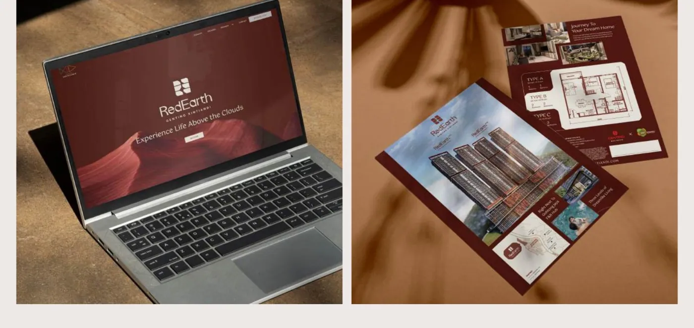
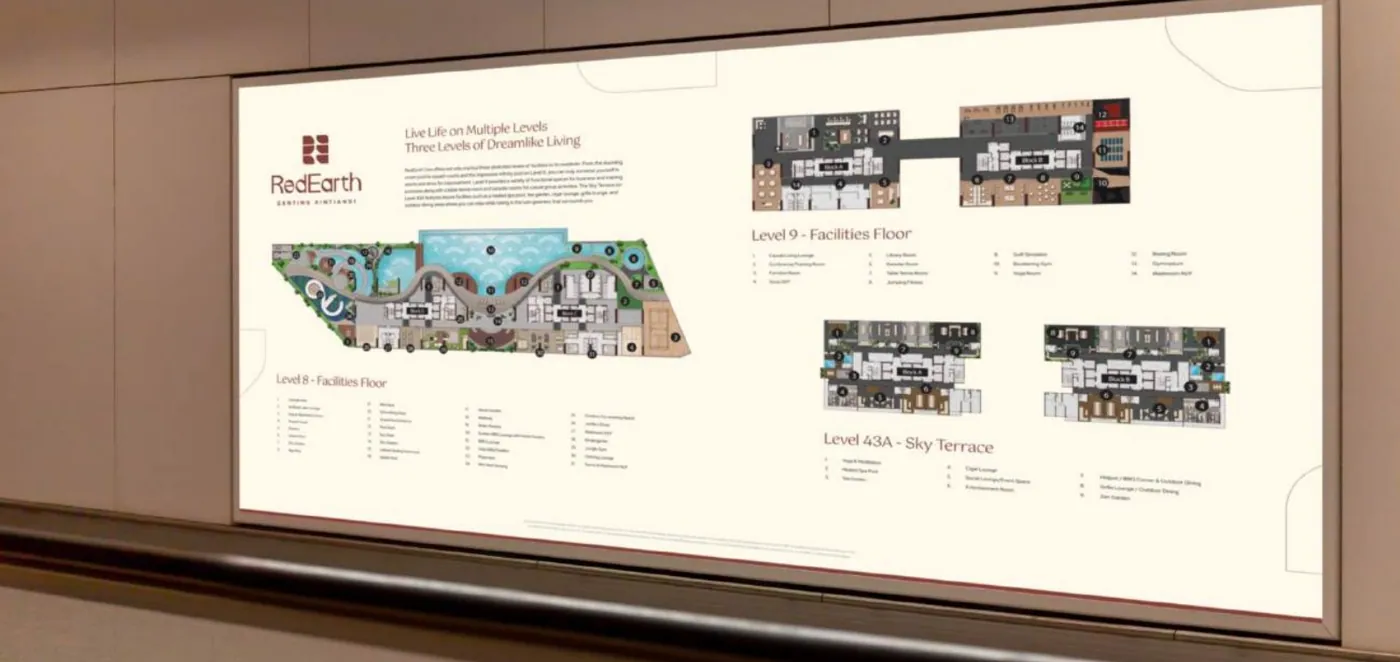
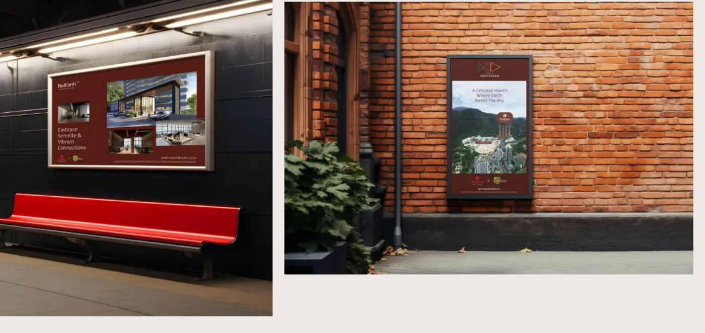
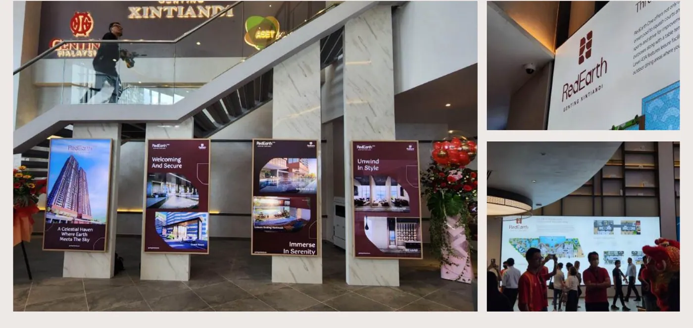
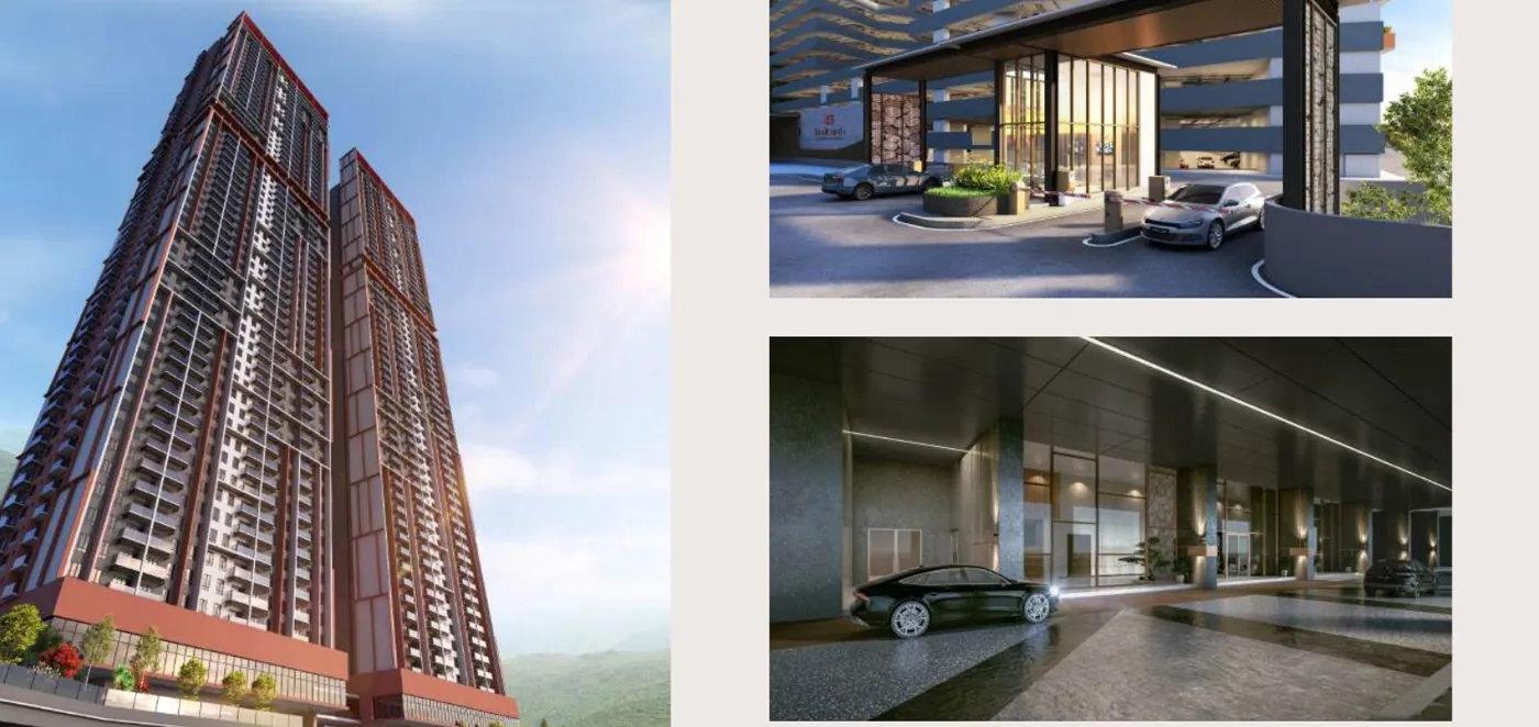
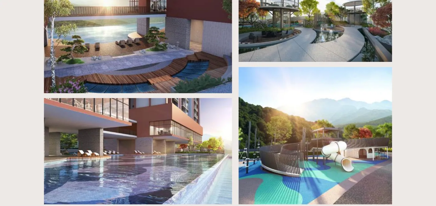
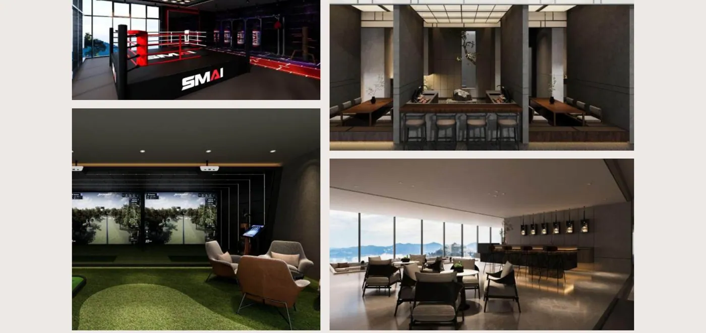
RedEarth.
Unearthing highland living with the essence of people and prosperity. Enabling the middle class to live amongst the clouds which sold-out during pre-launch.
Aset Kayamas Group and Genting Group joined forces for the first time in a groundbreaking venture to develop a visionary township set to redefine the landscape of Genting Highlands. With eight proposed themes for Genting Xintiandi, the initial challenge was determining which element to launch first. This decision was crucial as it would set the tone and expectations for the subsequent developments within this prestigious joint venture between Aset Kayamas Group and Genting Group. After careful consideration, we selected RedEarth as the first phase due to its association with prosperity and good fortune. The colours red and earth not only symbolise luck but also reflect the foundational aspects of this new development. Red represents prosperity and new beginnings, while earth denotes stability and the richness of the surrounding nature.